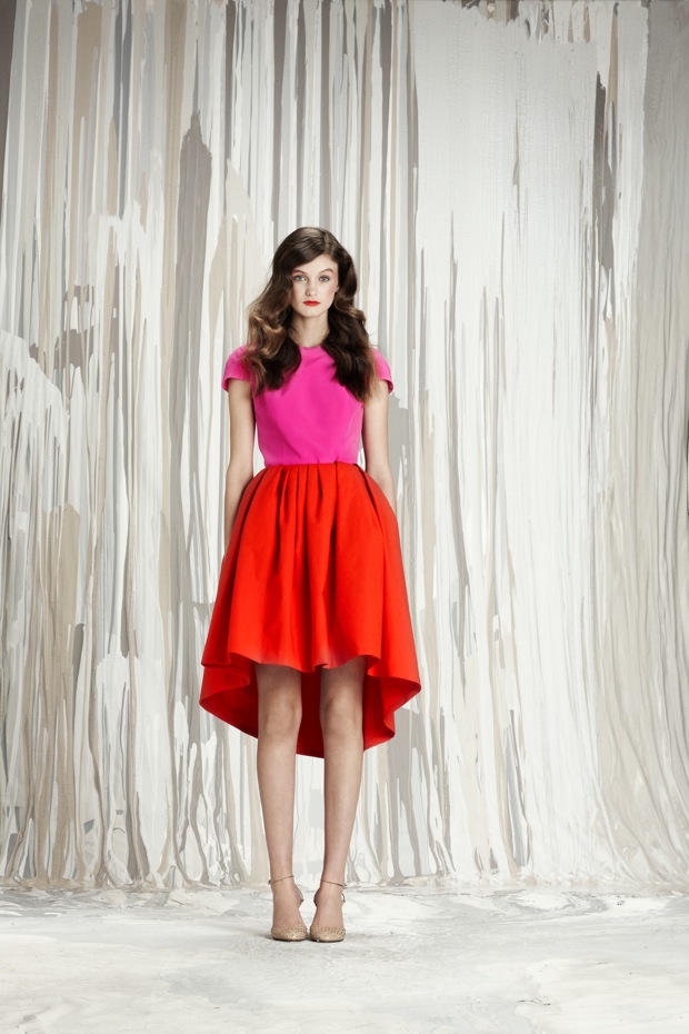
Muted tones are often the norm for fall and winter collections, but for pre-fall 2012 I appreciate the designers that aren’t afraid of a bright color. Here are three ways to work color into your wardrobe.
Neutralize It
The easiest way to get started with color is to combine it with a neutral. It was presented on the runway with mostly greys, but you can also combine a “neutral” print, such as stripes. If your top is a bright color, blue jeans are a safe way to go, but grey jeans add some edge.
Print-Upon
Prints are always a great way to put color in your wardrobe. It’s easiest to do a print if you wear one piece, so you don’t have to figure out coordinating color tones. Although wearing a solid turtleneck, à la Erdem, is a great way to anchor a busy pattern – if you can find the right color, that is.
Single Process Color
For the simplest application, but a bold statement – a single color story is the way to go. An earthy tone, à la Rachel Roy, is better for the color-faint of heart, while the cut-out plunging neckline shown at Honor is the most daring.

What's your opinion?